draft and proof revisited

serifless cell width and 1x spacing
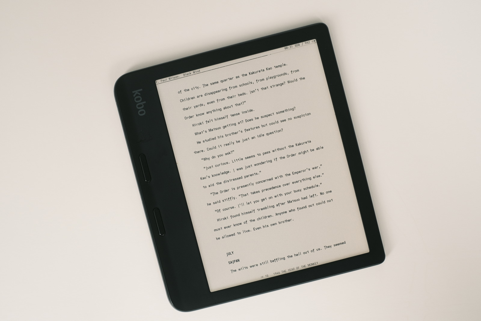
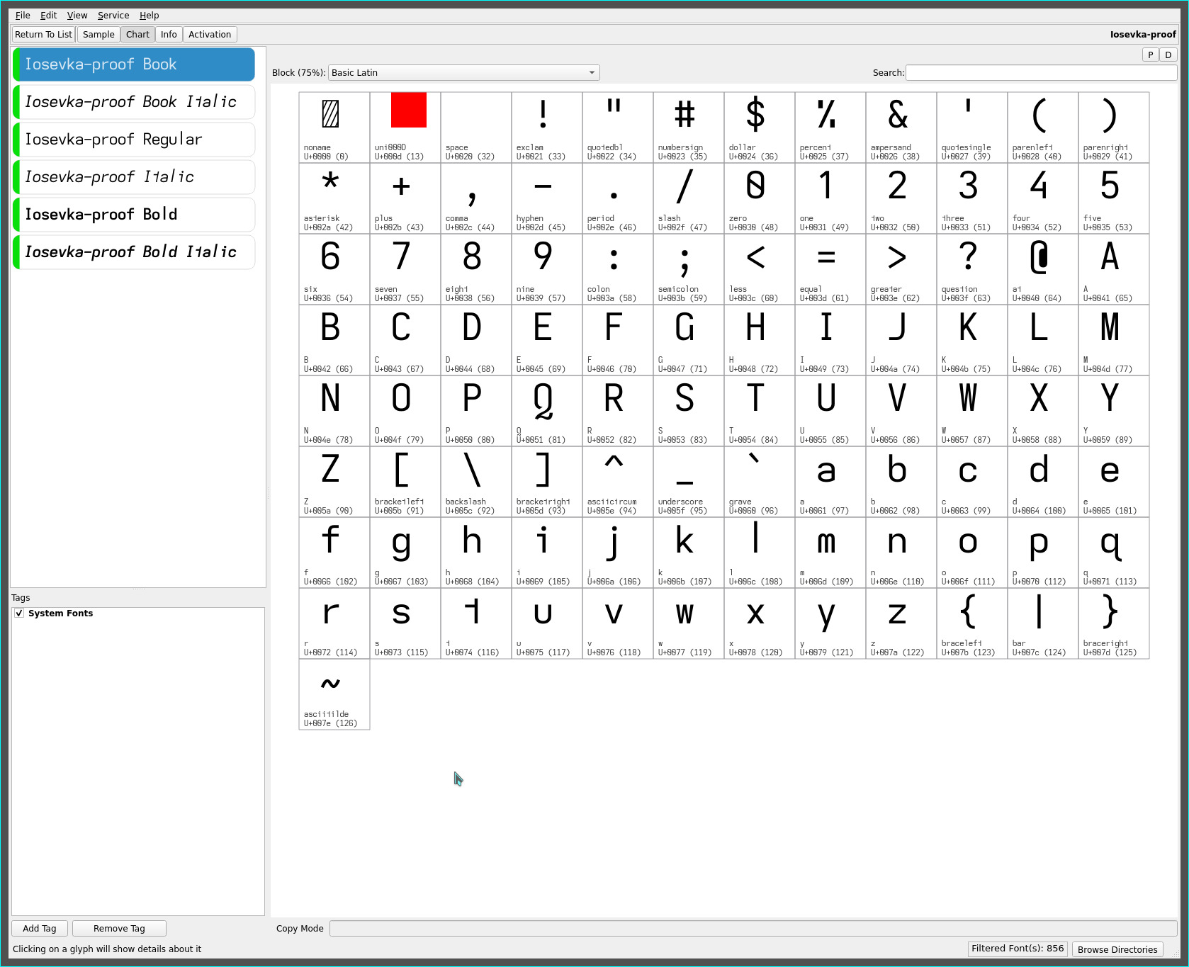
after extensive reading with the pencil font with its ascending lower case l and descending capital I, further cell width tightening for these single stroke serifless glyphs is possible without diminishing the overall monospaced visual cadence of the font—the extended lengths of the glyphs providing a distinctive visual separation from adjacent characters.
This in turn, allows a return—after several years!—to 1x cell width spacing while still preserving adequate word spacing—no doubt, my immersion with the pencil font cultivating a visual comfort with this spacing.
double storey “a”
prior to returning to the geometric roots of the pencil font, adrift had been my default ereading font for several months for its high legibility. Replacing the hooky lower case l with the new ascending l glyph transforms the font visually with minimal loss of legibility—the ascending glyph standing out “just enough” whilst also, heightening the new glyph set’s serifless flair.
As much as i gravitate towards the simple open geometric glyph shapes of Futura like fonts, there is no doubt about the increased ease of readability that is achieved with the double storey lower case a. With the new font cell width tunings and heightened legibility, the (revised) proof font has instantly become my current default ereader font, finding that balance between stroke simplicity, flare and readability..

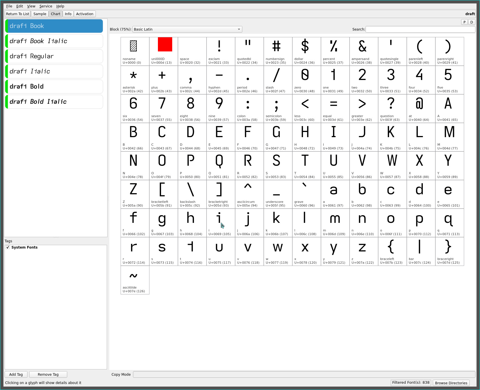
The draft font with its serifed capital I and standard height/descending fonts remains untouched save for the refined cell width adjustments and is reserved as a complement for page headers and footers..

As always, YMMV.
repos
These fonts may be found on OneDrive.